Wednesday, 14 April 2010

How to make a back up copy of your Mac OSX disc.


The following tutorial courtesy of creativebits.org will explain how to make a back up copy of your Mac OSX disc.


Making a DVD Image (copying the disc)

Step 1. Insert the retail Mac OS X Install DVD into your drive.

Step 2. Launch Disk Utility (Applications > Utilities).


Step 3. In Disk Utility, you will notice a white pane on the left hand side. In the pane, select the Mac OS X Install DVD by clicking on it once.

Step 4. Click New Image on the Disk Utility toolbar.

Step 5. A dialog box will appear. Give the new image a name. I used 'Mac OS X Install DVD'. Select the destination where you wish to save it. LeaveImage Format at Compressed (default) and Encryption at None (default).

Step 6. Click Save to begin creating the image.

Step 7. Once your image has been created DO NOT mount it. Leave the image alone and proceed to the next section.


Burning the Image


Step 1. Launch Disk Utility (Applications > Utilities).


Step 2. Click Burn on the Disk Utility toolbar (upper left).

Step 3. Navigate to where you saved the DVD image created in the previous section. Click on the image file, then click the Burn button. Do not drag and drop the image file into Disk Utility during this step.

Step 4. Insert a DVD when prompted and proceed to Burn it. (use good quality media)


You should now have a fully working copy of your Mac OSX disc.
Thursday, 8 April 2010

Tuesday, 6 April 2010

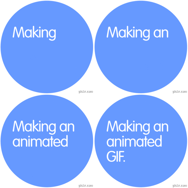
Making an animated gif.


It is extremely straight forward to make an animated gif.

1. Decide which images you would like to turn into an animated gif.

2. Safe the images all at the same dimensions and as jpegs or gifs.

3. Go to www.gickr.com and upload your images.

4. Specify the speed and size of your animated gif and click continue.

5. The website will now make and present you with your animated gif.

6. Copy the embedding code or save the gif to your computer by right clicking.

7. You can now upload to a blog or site your new animated gif in the same way as any other image.

What are the dimensions of the 'A' paper sizes?


It's always useful to know the exact measurement for the A paper series, so here thery are. Lucky you.

A10: 26.25 mm x 37 mm
A9: 37 mm x 52.5 mm
A8: 52.5 mm x 74 mm
A7: 74 mm x 105 mm
A6: 105 mm x 148 mm
A5: 148 mm x 210 mm
A4: 210 mm x 297 mm
A3: 297 mm x 420 mm
A2: 420 mm x 594 mm
A1: 594 mm x 841 mm
A0: 841 mm x 1189 mm

Friday, 7 August 2009

Designing a logo. The 5 most important things.


1. It must be memorable.


The very best logos throughout history have been simple designs; easily recognisable and easily remembered. Take for example the Nike swoosh or the McDonalds famous golden arches, both easy to picture and both easy to draw.


2. It must be able to work with and without colour.


Logos will often be used in black and white prints and therefore need to look great in black and white and shades of grey if required. Logos should be designed in black and white first to focus on the shape without the distraction of colour. Once the shape is perfect the colour can be added if desired to further its cause.


3. It must work at all sizes.


All successful logos need to be able to scale down to the smallest of sizes and still look great. Likewise the opposite is also true, when scaled up to larger dimensions the logo must appear faultless in it's compositional balance.


4. It must be appropriate.


A beautiful logo is pointless if it holds no relation to the business it is fronting. Before ideas for a logo design begin it is crucial to research into the line of business the logo is representing. It is more so important to identify the business' unique attributes that set it apart from it's competitors.


5. KISS


Keep It Simple Stupid!


Some of my logo designs of this year:


Click here to view more of my logos on my site.


Saturday, 1 August 2009

Liking the logo!


There have been many a classic logo through the years, well considered pieces of design that have seen some of the biggest businesses to the top of their game. But what is it that makes a good logo?
The FedEx logo is as good a place to start as any when talking logos. At first glass and probably second, third and fourth the FedEx logo will look exactly the same as your initial viewing. But what makes this logo interesting is what you can't see: Look carefully at the space produced between the 'E' and 'X'. Yes, it forms an arrow. The arrow is almost used subliminally to amplify their image of a fast paced delivery service.
The Amazon logo depicts a smile that also doubles up as an arrow. The arrow swoops down from the letter 'A' and into the 'Z' suggesting the extensive range of stock the shop has to offer. It is a very simple idea and one of the most recognisable logos of today. It is also interesting to note that the smile/arrow is often used by Amazon as a stand alone visual whereby no text is used at all.


The ABC logo, developed by Paul Rand, has been in use since 1962 and remains unmodified to this day. Rand said that he designed it for durability, function, usefulness, rightness, and beauty. The typeface used for the famous logo is a simple geometric design inspired by the Bauhaus school of the 1920s.


The Nike logo is one of the most simplistic and recognisable logos in the world and was designed by graphic design student Carolyn Davidson for a mere $35 in 1971. The logo became so recognisable that in 1995 the word Nike was often dropped to allow the swoosh to fly solo. Nike takes it's name from the Greek goddess of victory while the logos shape portrays the wings of the goddess.


The simple yet striking BMW logo dates back to the early 1900s during the years when they made airplane engines. The design is rumoured to represent a propellor (the white) on a blue background (the sky).


I have always liked the Neal's Yard logo long before studying Graphic Design. I love the fact the trees network of roots are given equal attention as the upper half of the tree suggesting that the roots determine the health of the tree. For a company that deals in natural skin care products I feel no other logo could be more relevant.


All time favourite movie..... poster


What are the best movie posters of all time and what is it that makes them so special?


This poster for Premonition starring Sandra Bullock is a particularly good example of how a poster is better than the film it's promoting. The film wasn't awful, it was quite good in places but I really like the attention to detail in the poster. Bullock's face can clearly be seen within the branches of the trees making this a very cool poster.


The poster for Little Miss Sun Shine captures the charm of the film wonderfully. I enjoy the poster's simplicty of colour using only shades of yellow, white and black to reflect the playful title.


The poster for Breakfast at Tiffany's is a beautiful illustrative design framed with bold funky primary colours that encapsulate the fashion of the time and Golightly's personality. Hepburn in her black dress jumps off the white page, owning the space as she did the screen. The overall composition has a less is more feel with plenty of white space to allow it to breathe.


Such a simple design with a huge impact. The yellow with black stripe reflects her clothing whilst creating a hard hitting visual that matches the boom of the film. The bold black type face only amplifies this message.


This poster for Trainspotting is purely typographical using the san serif Helvetica type face. It uses nothing more than punchy hard hitting text to give a sense of the films content without the typical routine use of actors or actresses mug shots.