There have been many a classic logo through the years, well considered pieces of design that have seen some of the biggest businesses to the top of their game. But what is it that makes a good logo?
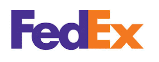
The FedEx logo is as good a place to start as any when talking logos. At first glass and probably second, third and fourth the FedEx logo will look exactly the same as your initial viewing. But what makes this logo interesting is what you can't see: Look carefully at the space produced between the 'E' and 'X'. Yes, it forms an arrow. The arrow is almost used subliminally to amplify their image of a fast paced delivery service.
The Amazon logo depicts a smile that also doubles up as an arrow. The arrow swoops down from the letter 'A' and into the 'Z' suggesting the extensive range of stock the shop has to offer. It is a very simple idea and one of the most recognisable logos of today. It is also interesting to note that the smile/arrow is often used by Amazon as a stand alone visual whereby no text is used at all.
The ABC logo, developed by Paul Rand, has been in use since 1962 and remains unmodified to this day. Rand said that he designed it for durability, function, usefulness, rightness, and beauty. The typeface used for the famous logo is a simple geometric design inspired by the Bauhaus school of the 1920s.
The Nike logo is one of the most simplistic and recognisable logos in the world and was designed by graphic design student Carolyn Davidson for a mere $35 in 1971. The logo became so recognisable that in 1995 the word Nike was often dropped to allow the swoosh to fly solo. Nike takes it's name from the Greek goddess of victory while the logos shape portrays the wings of the goddess.
The simple yet striking BMW logo dates back to the early 1900s during the years when they made airplane engines. The design is rumoured to represent a propellor (the white) on a blue background (the sky).
I have always liked the Neal's Yard logo long before studying Graphic Design. I love the fact the trees network of roots are given equal attention as the upper half of the tree suggesting that the roots determine the health of the tree. For a company that deals in natural skin care products I feel no other logo could be more relevant.


.JPG)
The FedEx logo is as good a place to start as any when talking logos. At first glass and probably second, third and fourth the FedEx logo will look exactly the same as your initial viewing. But what makes this logo interesting is what you can't see: Look carefully at the space produced between the 'E' and 'X'. Yes, it forms an arrow. The arrow is almost used subliminally to amplify their image of a fast
ReplyDeleteIn the second sentence it shoud say glance not glass, and recognizable has a z.